
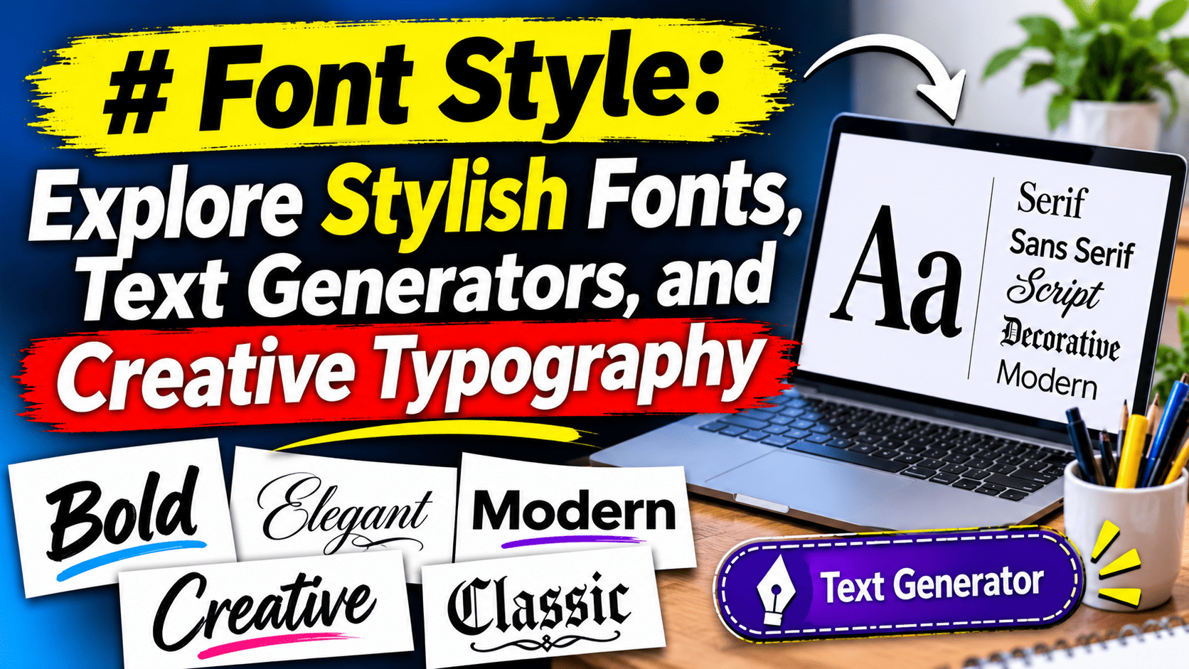
Font style refers to the visual appearance of letters, numbers, and symbols. Different styles, including bold, italic, serif, sans-serif, cursive, and decorative fonts, help people customize written content for different purposes. They are commonly used in websites, social media profiles, graphic design, branding, presentations, and digital communication.
Font styles influence how written content looks and how people experience digital information. From traditional serif typography to modern sans-serif lettering and decorative text, different designs serve different purposes. Online font generators allow users to transform ordinary text into visually distinctive characters that can be copied into compatible platforms. Choosing the right typography involves considering readability, accessibility, visual consistency, and the intended audience.
What Is Font Style?
A font style is the visual design of letters, numbers, and symbols used to display written information. It determines how text looks rather than changing the actual words or their meaning. Some fonts have simple and clean shapes, while others feature decorative curves, handwritten appearances, or heavier strokes.
Font styles play an important role in everyday digital communication. A website may use a clean sans-serif font to make information easier to read, while a creative brand might choose a distinctive display typeface to establish its visual identity. Similarly, social media users often customize their profile names and descriptions to create a recognizable appearance.
Typography is not simply about making words look attractive. It also helps organize information, establish visual hierarchy, communicate personality, and improve the reading experience.
Why Are Different Font Styles Important?
The appearance of written content can influence how readers perceive a message. A suitable font makes information easier to understand and gives a design a consistent visual identity.
Different font styles serve different purposes. Professional documents generally benefit from simple and readable typography, whereas invitations, posters, and creative projects may use more expressive lettering.
Here are some important reasons font selection matters:
- Readability: Clear lettering helps readers understand information without unnecessary effort.
- Visual identity: Consistent typography helps businesses and creators establish recognizable branding.
- Communication: Different styles can create formal, friendly, creative, or modern impressions.
- Content organization: Headings, subtitles, and body text can be distinguished through typography.
- Creative expression: Decorative lettering allows users to personalize digital content.
Choosing an appropriate style makes written communication more effective while maintaining a visually appealing presentation.
Types of Font Styles You Should Know
There are several major typography categories, each designed for a particular visual purpose. Understanding their differences makes it easier to select suitable lettering for websites, documents, social media, and creative projects.
1. Serif Fonts
Serif fonts feature small decorative strokes or extensions at the ends of certain letters. They are commonly associated with traditional publishing, formal documents, books, and editorial websites.
Popular examples include Times New Roman, Georgia, and Garamond. These typefaces are frequently selected for projects that require a classic and established appearance.
2. Sans-Serif Fonts
Sans-serif fonts do not have the decorative strokes found in serif typefaces. Their simple appearance makes them popular for websites, mobile applications, presentations, and digital interfaces.
Arial, Helvetica, Roboto, and Open Sans are well-known examples. They are particularly useful when designers want a clean and contemporary visual experience.
3. Bold Fonts
Bold typography uses thicker character strokes to make particular words more noticeable. It is commonly used in headlines, important announcements, buttons, and section headings.
Designers often combine bold lettering with regular text to establish a clear information hierarchy. However, using bold formatting throughout an entire page can make the content harder to scan.
4. Italic Fonts
Italic lettering features slanted characters and is often used to emphasize words, identify titles, or distinguish particular expressions within a paragraph.
It can add subtle visual variation without changing the overall design. Italics are especially useful in editorial writing, academic documents, and professional publications.
5. Cursive and Script Fonts
Cursive and script fonts imitate handwritten lettering. Their flowing characters can create an elegant, personal, or artistic appearance.
They are frequently used for wedding invitations, greeting cards, signatures, creative branding, and decorative graphics. Since some script typefaces are difficult to read in long passages, they are generally better suited to short text.
6. Monospace Fonts
Monospace fonts give every character the same horizontal space. This consistent alignment makes them useful for programming, technical documentation, code editors, and command-line interfaces.
Popular examples include Courier New, Consolas, and Roboto Mono. Developers often prefer these fonts because they make code easier to organize visually.
7. Decorative and Display Fonts
Display fonts are designed to attract attention rather than support lengthy reading. They can feature unusual shapes, artistic details, unusual proportions, or distinctive character designs.
These fonts work well for posters, logos, advertisements, event graphics, and promotional headlines. Their strongest use is usually in short phrases where visual impact matters.
What Is a Font Generator?
A font generator is an online tool that transforms ordinary text into different visual styles. Instead of manually installing multiple typefaces, users can enter a word or sentence and explore alternative text appearances.
Many generators provide options such as bold characters, italic lettering, decorative symbols, cursive-inspired text, and unusual Unicode character combinations.
The process is generally straightforward. Users enter their preferred text, review the available designs, select a suitable result, and copy it for use on a compatible platform.
However, it is important to understand that many online generators do not actually change the font installed on a device. Instead, they replace ordinary characters with visually similar Unicode characters. This distinction matters because not every application supports every character equally.
How to Use a Stylish Text Generator
Using an online typography generator usually requires only a few simple steps.
- Enter your text: Type a name, username, phrase, or short sentence into the generator.
- Explore available styles: Review different lettering options, including decorative, bold, cursive-inspired, and other variations.
- Select a design: Choose an appearance that matches your intended purpose.
- Copy the result: Use the copy option if the tool provides one, or select the generated text manually.
- Paste your text: Add the copied result to a supported social media profile, message, caption, or creative project.
- Check compatibility: Preview the text on the destination platform to make sure the characters display correctly.
For professional websites and documents, it is usually better to select an actual typeface through the relevant design or formatting software rather than relying on decorative Unicode characters.
Popular Font Styles for Social Media
Social media platforms have made personalized typography increasingly popular. People often customize profile names, biographies, captions, and posts to create a distinctive digital identity.
Different platforms have different formatting and character-support limitations, so a style that works in one place may not appear correctly elsewhere.
Instagram users frequently experiment with decorative lettering in profile biographies, captions, and display names. Stylish characters can help separate information and create a distinctive appearance.
However, excessive decorative text may reduce readability, particularly for visitors using accessibility tools.
Facebook users may use alternative character styles in posts, profile descriptions, and group content. Simple variations can help highlight short phrases or create a recognizable presentation.
Regular text remains the more reliable choice for important announcements and longer messages.
TikTok
TikTok creators often customize profile descriptions and video captions to match their content themes. Decorative typography can complement creative videos, personal branding, and entertainment-focused profiles.
It is still important to keep essential information easy to understand.
WhatsApp supports several built-in text formatting options, including bold, italic, strikethrough, and monospace formatting. These features can make messages easier to organize without requiring an external generator.
Users should distinguish between the application’s native formatting features and Unicode-based decorative characters.
Font Styles for Different Purposes
Not every typeface is suitable for every project. The best choice depends on the content, audience, platform, and overall design objective.
| Purpose | Suitable font categories | Main reason |
| Business websites | Sans-serif | Clean and readable appearance |
| Books and articles | Serif | Traditional editorial presentation |
| Social media profiles | Decorative and bold | Personal expression |
| Invitations | Script and cursive | Elegant presentation |
| Programming | Monospace | Consistent character spacing |
| Advertising posters | Display | Strong visual impact |
| Professional documents | Serif and sans-serif | Clear information presentation |
| Presentation slides | Sans-serif | Easy viewing on screens |
A consistent typography system is often more effective than combining many unrelated styles. Using two or three complementary typefaces can create a more organized and professional design.
How to Choose the Right Font Style
Selecting suitable typography requires more than choosing the most attractive design. A good decision considers how the text will be displayed and who will read it.
Consider Readability First
The most important consideration is whether people can read the content comfortably. Highly decorative lettering may look interesting in a heading but become difficult to follow in a long paragraph.
For websites, articles, and educational resources, prioritize clear character shapes and comfortable spacing.
Understand Your Audience
Different audiences may respond to different visual approaches. A corporate website generally requires a more restrained appearance, while a creative portfolio may benefit from expressive typography.
Think about the expectations of your intended readers before choosing a design.
Match the Design to Your Brand
Typography contributes to brand recognition. Businesses should use a consistent selection of typefaces across their websites, marketing materials, presentations, and other communication channels.
A consistent visual approach makes the overall brand experience easier to recognize.
Check Device Compatibility
A typeface that looks attractive on a desktop computer may not display identically on a mobile phone. Some characters may appear differently depending on the operating system, application, and available fonts.
Always test important text on different screen sizes and devices.
Avoid Excessive Decoration
Using too many typefaces or decorative characters can make a design look inconsistent. Choose a small number of complementary styles and use them with a clear purpose.
For most websites, simplicity creates a better reading experience.
Understanding Unicode Fonts and Regular Fonts
One of the most important distinctions in online typography is the difference between actual typefaces and Unicode characters.
An actual font is a collection of visual instructions that determines how characters appear when displayed by a computer or application. Changing the font in a word processor usually changes the visual design without changing the underlying text characters.
Unicode, on the other hand, is an international character-encoding standard. It assigns unique codes to characters from many writing systems, symbols, and other text elements.
Some online generators use Unicode characters that resemble decorative letters. For example, a generator might replace ordinary Latin letters with mathematical alphanumeric symbols to create a bold or script-like appearance.
This method can be convenient because users may copy and paste the result without installing additional fonts. Nevertheless, there are limitations:
- Some devices may display unsupported characters as empty boxes.
- Screen readers may interpret decorative characters differently.
- Search engines and applications may not process them like ordinary text.
- Certain platforms may restrict or normalize unusual characters.
- Copying decorative text into professional documents can create formatting problems.
For accessible digital content, standard Unicode text combined with an appropriately selected typeface is generally the more dependable approach.
The Role of Typography in Website Design
Typography is an essential part of website design because it influences how visitors interact with information. A website can contain useful content, but poor typography may make it difficult for visitors to read and navigate.
Web designers typically combine different typeface weights and sizes to create visual hierarchy. For example, a large heading introduces a topic, a smaller subheading organizes information, and regular body text provides the details.
Website typography also affects the overall visual identity of a business. A technology website might use a modern sans-serif typeface, while an editorial publication could prefer a traditional serif design.
Several factors should be considered when selecting website typography:
- Font size: Body text should be comfortable to read on desktop and mobile screens.
- Line spacing: Appropriate spacing prevents paragraphs from appearing crowded.
- Character spacing: Letter spacing should support readability rather than create unnecessary gaps.
- Contrast: Text should stand out clearly against its background.
- Consistency: Headings, paragraphs, buttons, and navigation should follow a recognizable design system.
Good typography helps visitors understand website content without unnecessary visual distractions.
Can Font Styles Affect SEO?
Typography is not a direct ranking shortcut, and selecting an attractive typeface does not automatically improve a website’s Google position. However, typography can support several aspects of website quality that matter to visitors.
For example, readable text makes it easier for people to consume information. Clear headings help organize content, while appropriate spacing improves the overall reading experience.
Website owners should also consider technical performance. Large or poorly optimized font files can increase loading time, particularly on mobile devices.
Here are some useful practices:
- Use descriptive HTML headings to organize page content.
- Choose readable typefaces for paragraphs and important information.
- Optimize custom font files to reduce unnecessary loading.
- Use appropriate font-display settings to improve text rendering.
- Maintain sufficient contrast between text and background.
- Avoid replacing important website content with decorative Unicode characters.
Search optimization should focus on helpful information, clear structure, accessibility, and technical performance rather than typography alone.
Best Practices for Using Font Styles in Graphic Design
Graphic designers use typography to communicate ideas and establish visual relationships between different elements. The right combination can make a poster, advertisement, presentation, or promotional graphic more effective.
A few practical principles can improve typography in creative projects.
Create a visual hierarchy: Use different sizes and weights to show which information deserves the most attention.
Limit font combinations: Two complementary typefaces are often sufficient for a straightforward design.
Maintain consistent alignment: Proper alignment makes text appear organized and balanced.
Use decorative fonts carefully: Display and script typefaces are most effective when reserved for short headings or selected design elements.
Leave enough empty space: Text needs breathing room. Crowded designs can make even attractive typography difficult to understand.
Following these principles helps create designs that look organized without sacrificing readability.
Common Mistakes to Avoid When Choosing Typography
Even an attractive typeface can create problems when used incorrectly. Understanding common mistakes can help designers and website owners make better decisions.
Using Too Many Different Fonts
Combining numerous unrelated typefaces can make a design appear inconsistent. A limited typography system usually creates a more professional result.
Ignoring Mobile Readability
Some fonts look attractive on large screens but become difficult to read on smaller displays. Responsive testing is essential for modern websites.
Choosing Appearance Over Clarity
Decorative lettering should never make important information unnecessarily difficult to understand. Readability should remain a priority.
Ignoring Accessibility
Unusual Unicode characters can create difficulties for some screen readers and assistive technologies. Standard text and semantic formatting are generally preferable.
Using Inconsistent Typography
Changing typefaces randomly across different pages can weaken a website’s visual identity. Consistent heading and body-text styles create a more recognizable experience.
Future Trends in Digital Typography
Digital typography continues to evolve as websites, applications, and creative software introduce more flexible design options.
Variable fonts are an important development. They allow designers to adjust characteristics such as weight, width, and other supported properties within a single font file. This can provide greater design flexibility without requiring numerous separate font files.
Responsive typography is another growing design practice. Instead of using identical text sizes on every screen, designers can adjust typography according to available space and device dimensions.
Other developments include:
- Variable and responsive typefaces.
- More accessible typography systems.
- Improved multilingual font support.
- Custom lettering for digital branding.
- More flexible typography in web applications.
- Better optimization of web font delivery.
These developments give designers additional ways to create distinctive digital experiences while maintaining usability.
Frequently Asked Questions
1. What is a font style?
A font style describes the visual appearance of written characters. It includes characteristics such as weight, shape, width, slant, and decorative details. Common examples include serif, sans-serif, bold, italic, cursive, and monospace.
2. How can I create stylish text online?
You can use an online text generator by entering ordinary words, exploring available designs, selecting your preferred appearance, and copying the result. Check whether the destination platform supports the generated characters before publishing.
3. What is the difference between a font and a typeface?
A typeface refers to the overall design of a collection of characters, while a font traditionally refers to a particular implementation of that design, including its weight and style. In everyday digital communication, the terms are frequently used interchangeably.
4. Which font style is best for websites?
Sans-serif typefaces are popular for websites because many offer clean character shapes and good screen readability. However, serif typefaces can also work effectively when selected and implemented appropriately.
5. Can I copy and paste stylish fonts on Instagram?
Yes. Many decorative text generators produce Unicode characters that can be copied into Instagram biographies and other supported text fields. However, some characters may not display consistently across devices.
6. Are online font generators free?
Many online generators provide basic text customization without charging users. Some services may offer additional features, premium designs, or downloadable font files through paid plans.
7. Do decorative fonts affect accessibility?
They can. Decorative Unicode characters may be interpreted differently by screen readers, making some text difficult to understand. Standard characters with appropriate visual formatting are generally a better option for accessible content.
Conclusion
Typography is an important part of digital communication, creative design, and online branding. Different typeface categories provide different visual experiences, from the traditional appearance of serif lettering to the simplicity of sans-serif designs and the expressive character of decorative typography.
Understanding how these styles work makes it easier to choose suitable typography for websites, social media profiles, professional documents, and creative projects. Online generators also make text customization more convenient, although compatibility and accessibility should always be considered.